A user decides whether he or she wants to browse a web page just in a split of a second. And the color or color combination of your site plays an extremely important role in this decision-making process. Don’t agree? Then think of this question: would you buy a pair of yellow-green trousers and go to an important meeting in them? Of course not, because the colors do not match at all and you will look, to put it simply, ridiculous. But a pair of dark-blue trousers will be perfect for the occasion. Why? Because this color is considered to be a part of business attire.
A similar perception of color occurs when the visitor sees the site. The design of the web resource is the first thing that catches the eye of a user, and its color is the first aspect that is evaluated. Instantly, subconsciously, the visitor decides whether he or she likes the colors of the site and can understand if they evoke pleasant and correct associations or, on the contrary, repulse and form negative emotions. And based on these emotions, one’s brain decides to continue browsing the web page or close it.
That is why it is important to know what colors to choose for your online resource and how to combine them to form the right associations and impressions in the user’s mind. The right colors motivate visitors to view the site and contribute to increased sales.
In this article, we will provide detailed instructions on how to work with a color palette and the color scheme for a website. Even if you are new to this whole web design theme, this guide will help you create an attractive and reader-friendly web page with minimum effort.
How the Color of a Website and Its Style Depend on Your Target Audience
The choice of website style in terms of its color performance should directly depend on the target audience. A target audience or target group is a category of people who are most likely to visit your web resource and make targeted actions (order a specific product or service, answer the questions of the quiz, watch a video, etc.). To determine the target audience, consider the age category, occupation, preferences, and interests of your potential visitors. For instance, if an online store sells brand-new cars, its target group is mostly wealthy men over 35.
- But age is not the only factor you should consider. Here are a few more:
- Demographical factors: gender, marital status, education, occupation;
- Economical aspects: workplace, income level;
- Psychological issues: character, hobbies, lifestyle.
The combination of colors on the site must match the target audience. Therefore, before you finally choose a color scheme, you need to study your potential buyer in detail. Only then you can correctly apply the principles of color psychology.
Where Are Your Clients from?
Are you going to work in one country or all over the world? Don’t forget about the mental specificities of perception. While many associations are universal (such as yellow for sun, green for nature, etc.), some colors can be negatively perceived in a particular country. For example, in South America, the green color symbolizes death. The blue shade is associated with patriotism in the United States and with healing in China. In some Asian countries like Japan, the white color represents mourning. Therefore, check out the cultural code of your target audience before you start promoting overseas.
What Gender Do You Design for?
What gender is your business focused on? Men and women perceive some colors differently. Color perception studies have shown that both sexes prefer blue or similar colors. Women are more attracted to the shades that are closer to the red end of the color spectrum. It was discovered that female visitors often choose softer colors, and male users are more fond of the bright ones. The researchers have also found that the most disfavored shades among both genders are white, yellow, and brown. 27% of men say that brown is their least favorite color, and 33% are of the same opinion about orange. But the biggest gender difference in color perception was noted when analyzing purple color: men do not like it at all, while women say it is their second most popular shade.
However, it doesn’t mean that you should immediately choose blue as the main color for your website. Just think about how many web resources have already been designed in a similar color, especially that of your competitors! It is not to mention that this color may not correspond to the corporate style of your company and the preferences of your target group.
Choosing a website color is a difficult and responsible task. Don’t solve it based on a single study or your color preference. The site must achieve several goals, including the distinction from competitors, which can be accomplished by choosing the right color solution.
How Old Are Your Customers?
A person’s preferences can change with age. According to the studies, young people, especially those under the age of 25, mostly prefer red shades. Among them are people with a healthy nervous system: children, teenagers, and adults who like physical labor and have the sanguine or choleric temperament. They are usually open-minded and can directly express their feelings. Such individuals prefer simple, clean, and bright colors, as well as contrasting color combinations that act as strong action triggers.
The older people get, the more they fancy dark and muted color tones. For instance, the middle-aged and elderly people love various shades of blue, green, and purple; they reject active colors like red and yellow and prefer gray, brown, and dark-green.
The most unfavorite colors among young people under 18 are purple and brown, and the members of the older generation dislike yellow and its shades.
What Niche Do You Work in?
Colors are often associated with a specific industry. Have you noticed that pharmacy signs are usually green, and five-star hotels are black or white? And what is your activity associated with? For instance, if you plan to sell healthy lifestyle products, it’s logical to use green or brown shades that resemble nature. And if your web page offers sweets for kids, you may want to design it in bright orange or yellow because they are associated with youth and joy.
There are also certain taboos you should be aware of:
- Red color should not be used by medical facilities because it evokes negative emotions.
- Black should be omitted on agricultural, household, food, financial, and healthcare-themed resources.
- Yellow is not usually applied in healthcare, aviation, clothing, automobiles, and finance websites.
- Orange can be rarely noticed in the technological, energy, and clothing industries.
Colors for the Site: How to Choose?
After you have determined one or several target groups for your website, it’s time to choose the specific color schemes for each group. Here are general rules on how to do it:
- The best colors for children-themed pages are pink and purple for girls, blue and green for boys, and orange and yellow for both genders. Pick bright, contrasting, and positive tones that catch kids’ attention.
- For resources that will be popular among women and teenage girls, you should use gentle and bright colors.
- Websites for men look best in dark or neutral shades.
Of course, every detail needs to be thought out. If your target audience includes both men and women (for example, you sell wine), then you should rely on neutrality.
In case your product owns a corporate identity and a logo that has already been promoted on the Internet and is recognizable by your customers, it makes sense to design the site in the appropriate colors. You can use the “corporate” shade as a predominant for the web page. But don’t forget about the rules of contrast and call-to-action colors. Pay attention to how the logo tones are combined with others and how they look in the design. In some cases, logo colors can be replaced with similar undertones or adjusted in intensity, hardness, and other color options.
What Are Color Models?
When designing a web resource, you should also consider color models. There are lots of them, but the most popular ones and the ones you should be aware of are RGB and CMYK models.
RGB is based on three primary colors: red, green, and blue. All other shades are formed by mixing these colors. In HTML, shades are encoded with characters 00 to FF, preceded by a # sign.
CMYK is based on four primary colors: cyan, magenta, yellow, and black, and it includes the shades formed by their combination. This model is mainly used in printing. In web design, this combination of colors looks bright and unusual and attracts visitors’ attention.
How to Combine Colors for a Website
To match colors for a website, you can use one of the following schemes:
- Analogical – 3 shades from neighboring sections are selected; one is used as the basis, and the other two play part of a background and accent colors.
- Complementary – two contrasting shades are picked as a base, and they are accompanied by several other colors.
- Split – this method resembles a complementary scheme, but in this case, one of the contrasting colors is replaced by two similar ones selected from the neighboring segments of the circle.
- Monochromatic – a rare method that implies choosing one key color and using its shades as additional tones.
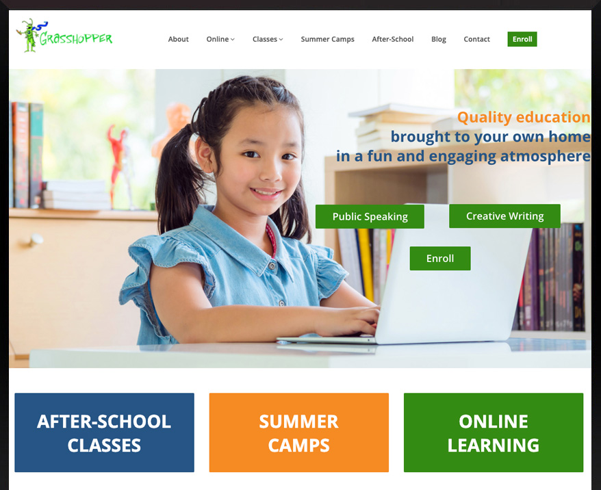
Here is a good example of a monochromatic color combination scheme:

The designers from Alice Wonder have blended light backgrounds with bright front and minimalistic buttons. The company name is perfectly highlighted.
If the process of choosing matching colors seems difficult for you, then stick to the principle of simplicity: don’t use more than 3 or 4 different colors and choose matching shades. Of course, it is a basic example. Modern designers and architects use thousands of shades presented in special online services like Colors, Flat UI Colors, and Colordot.
Don’t Forget About Trends
If you want to keep up to date and make your website as modern as possible, then pay attention to color trends. Yes, they change every year, but it doesn’t mean that you need to change the web page as often. However, you should be aware of the popular color and color mixing trends; otherwise, you may end up designing a web resource that will look boring and outdated.
You may start by learning about Pantone and its color of the year. Every year, the Pantone Color Institute chooses one shade that will dominate the world of design. This color is incorporated in all kinds of industries: fashion, home décor, packaging, and, of course, web design. In 2020, the choice of Pantone fell on Classic Blue, which is listed in the color palette as Pantone 19-4052. According to the Institute’s researchers, this shade is durable and elegant in its simplicity. It evokes thoughts of an endless evening sky, which opens up a huge world of possibilities for each of us. This simple color is associated with reliability and peace.
Last year, a different shade played the most important part. It was Living Coral. Therefore, the transition to Classic Blue looks even more impressive and surprising.
Remember About Proportions
How to combine the shades? Professional designers often use the principle of harmony: 60% for the main color, 30% for background, and 10% for accents. You don’t have to strictly follow this rule, but it is worth keeping it in mind because such composition is most pleasing for the human eye.
Think about logo colors
Designers often place the logo in the most prominent place like the header of the page and execute it in one of the brand’s corporate colors. Here are a few simple guidelines for successful logo incorporation:
- The color of the logo should be in harmony with the background, but not merge with it.
- If it suits you, change the shade of the trademark by adjusting the contrast or brightness.
- Leave enough free space around the logo to make it visible.
Here is a good example made by Alice Wonder web studio:
See how noticeable the green logo looks on the white background. Plus, there is plenty of free space around it.
Technical Peculiarities
When designing a website, keep in mind that the color that you see on the screen may not be the same as the visitors’ will see it on their computer or mobile device. It can differ depending on the light level and settings of the user’s monitor. For example, you can make a green background, but users will see it as a toxic green, or a woman who wants to buy a red skirt will see it as pink. Therefore, don’t forget to test your design on different computers and with various lighting before you launch it.
Color Contrasts
Each color has its opposite shade. The colors that contrast with the main one are usually used as accents on the web page: they highlight triggers, headings, and subheadings. Contrasting colors attract visitors’ attention and create calls for action. It is very easy to identify two colors that contrast with each other. The simplest way to do it is to select one color from the circle and draw a line to the other.
However, there are several other ways to create color contrasts for website design:
Color tones
Using high-contrast colors such as black and white or blue and yellow creates the optimal accent. It is a practical and effective method for highlighting the most important information.
Lightness of tone
When choosing contrasting colors, it is not necessary to use only the classic method. Applying a lighter and darker shade of the same color will create a harmonious composition, allowing you to highlight the necessary parts of the design.
Color temperature
All existing colors can be divided into three groups in terms of temperature:
Warm: red, orange, and yellow;
Cool: green and blue;
Neutral: black and white.
Using several tones of different temperatures (red and white, blue and white) will create a dynamic but logically combined contrast.
Color intensity
The less gray in a color, the more saturated it is. Using less intense color for the background and more saturated for accents will create the perfect tandem. The pure colors grab attention in the first place. They work well for triggers.
Color spread
The combination of bright highlights on a neutral background creates a very harmonious and attractive website design. The simple and elegant introduction of contrasting shades creates effective accents one cannot stop looking at.
How Is the Color Palette of the Site Perceived by the User?
Each color evokes certain associations in the human brain. A tone or shade can bring out both positive and negative emotions. Therefore, when choosing a palette for an online resource, it’s very important to know and understand the basic principles of color psychology.
Before we start introducing the principles of color perception, it should be mentioned that human sensitivity and evaluation function always depend on one’s temperament and mood. The place of residence and religion also play an important part in these processes. For example, a Christian may associate beige with extreme simplicity, and a person following Buddhism will see it as pure elegance and tranquility. We will describe the most common color associations typical for Western culture.
Red
Red says “danger”, “excitement”, “passion”, “strength”, “aggression,” and “success”. It’s a shocking color, which completely grabs the viewer’s attention and requires time to be perceived. If a person looks at the red color for some time, he or she will get increased heart rate and blood pressure. Ever wondered why so many fast-food restaurants are painted in red? This color activates the feelings of hunger forcing us to eat more than we need.
Red is also more noticeable than others. It encourages people to make quick decisions and, at the same time, creates a warm feeling (the coffee looks hotter in a red cup than in a green one).
Red grabs attention and brings the objects to the front. That’s why this color is most often used by designers for highlighting conversion elements: lead-generating buttons and call-to-action forms. Intense red is the color that expresses speed, power, play, danger, and passion. It’s often chosen for web resources that promote gambling, energy drinks, cars, and sports.
But don’t forget that red is an emotional color. Therefore, you should not get carried away with it. Use it as the main shade only when the user needs to be warned. Otherwise, it should be brought for play just as an accent tone.
Orange
This color is formed by mixing red and yellow; so, it has characteristics of both of them. It possesses the energy and vitality of red and creates a sense of happiness like yellow. Orange encourages impulsiveness and pleasure. It’s extremely eye-catching; thus, it is often used as a warning color. The hot color is also identified with good quality, which is why marketers like applying it for sales campaigns.
Orange is widely spread over the World Wide Web, especially on websites dedicated to event planning, entertainment, baby products, healthcare, and information technology.
This shade inspires positive emotions and enhances creativity. It is associated with friendliness, movement, energy, and youth. If you take orange as the main background color, it will create a feeling of enthusiasm and joy. Since orange is a vibrant color, it can be also used for highlights. It copes with this task as good as red.
Yellow
Psychologists say that yellow is the happiest color in the spectrum. It creates a feeling of confidence and joy. Most people associate it with the sun, wisdom, intelligence, and imagination. Yellow is the color of happiness, enthusiasm, and childhood, but, depending on the theme of the web page, it may not play a childish role. On the contrary, it can show the consumer that such a site belongs to professionals.
Yellow can give refreshing energy to your website. Its perception may be compared to red. Black characters on a yellow background make the most distinguishable shade combination for the human eye. The muted tones of this color encourage communication, and the golden ones bring out the idea of wealth. But keep in mind that a considerable amount of yellow color can be annoying; so, use it wisely.
Green
This color is placed between blue (the relaxing shade) and yellow (the shade of energy), and it creates the perfect balance between them. Green means life and growth. It’s associated with calmness, well-being, evolution, and stability. It is believed to have healing properties and the ability to soothe and relax viewers. The more muted the green color is, the higher are its soothing properties.
Light green tones remind spring and nature. They are often used for kids’ themes. Deep green color states for experience and strength. It’s especially popular among lawyers and financiers. By the way, it is the color of money!
Banks, pharmacies, SPA centers, organic goods, food, children, health – these are only a few topics that can be associated with green. If you design a web resource that is aimed to help people, green is the most suitable color to convey your message.
Blue
When people see a blue color, they think of the sky and calm sea. This color has been a symbol of loyalty, hope, and faith for centuries. It’s also the color of trust; therefore, it’s often used for expressing frankness. Depending on the saturation of the color, it can be perceived in different ways. For example, light colors are used as a sign of trust (note that social networks like Twitter and Facebook use the light blue color). Dark-blue shades create a sense of reliability, dignity, stability, and social status.
The blue color also looks rich and luxurious. It signifies safety, consistency, professionalism, power, trust, and calmness. It can be found on the websites that represent law firms, banks, online retailers (especially those selling air conditioners, seafood, boats, water, and water filters), consulting companies, IT firms, airlines, tourism, social media, payment systems, and healthcare centers.
Purple
From time immemorial, purple was considered to be the color of royalty. This shade evokes associations like wealth, luxury, and mystical secrets. Purple is widely used in the cosmetics, food, and IT industries. It personifies prosperity and high status. It works especially well in online stores that sell products for women of any age.
Light shades like lilac create a sense of pomp and style, and the dark ones can make your site look romantic and mystical.
White
This color is associated with purity, innocence, and loyalty. It’s no wonder it’s so popular at weddings. White also symbolizes kindness, truth, and justice. We all heard of a “White Knight,” right? It’s often used to express sterility and safety.
Although white is a neutral shade, most people perceive it as cold color because it is associated with snow and ice. You can find a great number of web pages that use it as the main background. Today, such a type of web design looks fashionable and trendy. White color creates the effect of minimalism but, at the same time, makes the site stylish. It can be combined with any dark tone, which allows you to make noticeable and attractive accents.
Black
Undoubtedly, black is the most powerful and overwhelming color in the spectrum. It has always been viewed as a respectful and conservative shade. This color represents authority, superiority, elegance, strength, sophistication, luxury, glamor, and mystery. It is widely used to sell luxury products or goods that help create a stylish look.
Black is associated with greatness and dominance. Therefore, large companies often use it as their main background. It goes well with light and pastel colors that create bright accents. Black, just like white, can stand for minimalism, but, at the same time, it evokes more positive emotions.
However, you should be careful with this shade in your design. It is very important not to overuse it. Otherwise, your website may go from a luxurious color scheme into a mourning one, causing negative visitor emotions.
It is a textbook case of using black for the background
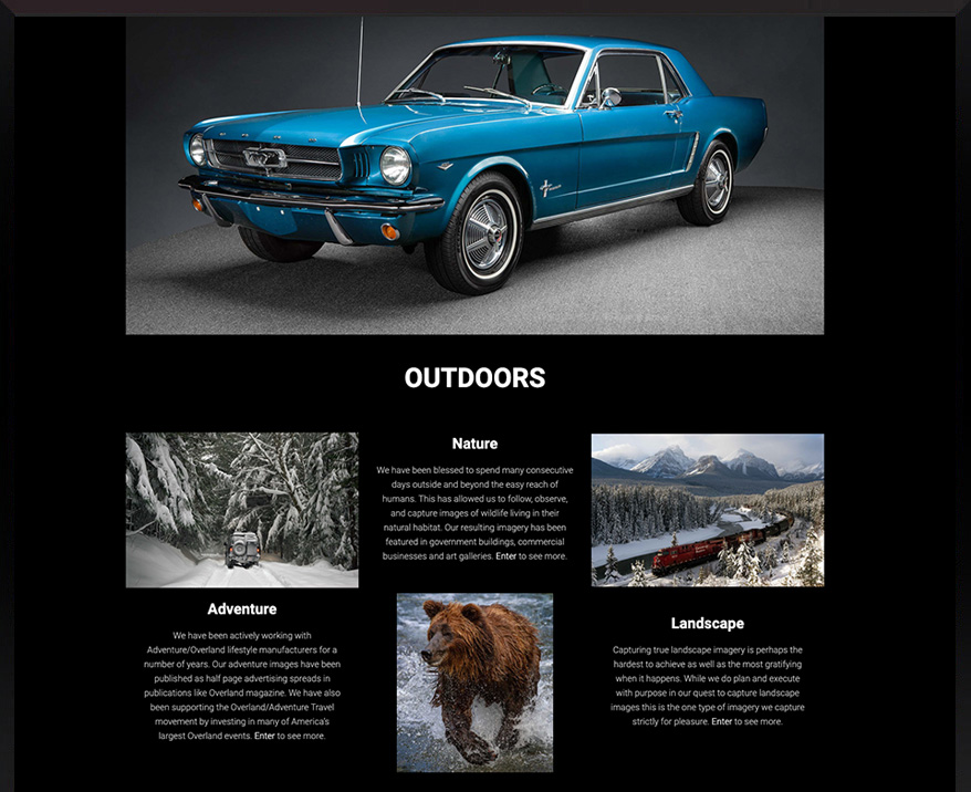
The wizards from Alice Wonder know how to make black look bright and fabulous!
How to Decide Between Primary, Secondary, and Background Shades
When choosing a color palette for your online resource, select each shade gradually.
First, you need to determine the main color. It is often used more and can highlight major headings or important information.
Choose the secondary color. – It will highlight information of minor importance.
Accent color is the most important tool for grabbing visitors’ attention. It should be in contrast to both the main and the background colors.
The background is the color that prevails on the web page. It fills all the free space. This color has to interact with all other shades but not to attract attention.
Conclusion
The choice of web resource color is extremely important for brand image and product promotion. It helps a web page to stand out from competitors and gain customer loyalty. Let’s summarize the main rules for selecting the perfect color scheme:
- Keep the focus on your target audience.
- Choosing a color scheme should not be based on your taste or intuition alone. Conduct a thorough marketing analysis before making a decision.
- To design a site, you do not need to have experience or special education.
- Use professional articles like this one to gather information and practice, practice, practice!
- If you’re unsure where to start, make a list of the top brands in your niche that you like. Analyze what shades they use and take their decisions as a basis.